Sunday 28 February 2010

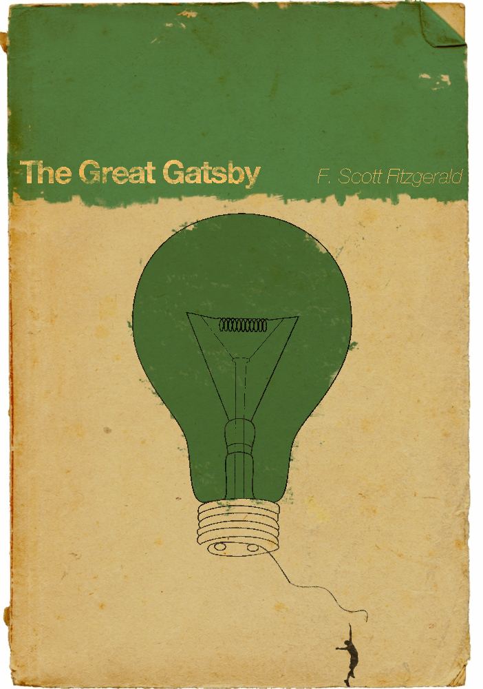
Alternate book covers


See the set here.


See the set here.


See the set here.

More alternate film posters


See more here.

We've all been there...


See more great prints here.

Saturday 27 February 2010

Retro Film Book Covers


See more here.

Stephen King Film Posters


A collection of 'minimal' posters for Stephen King's most popular films.

Quentin Tarantino Film Posters


Available for purchase here.

Great Tip.

There is a pdf on this link on how to get a design job.
Loads of good information, even if the layout is a bit rubbish.

http://www.aiga.org/content.cfm/get-a-job

Friday 26 February 2010

February's inspiration mega post


Link


Link

Free font:


Here.

Propaganda:

Here.

Prints!

More here.

Lastly, clients from hell.

Strange animals


More here

And here

How to...


More here

Tuesday 23 February 2010

Repeat Pattern blog


Link

I like the vernacular...Not!


This book contains the essay by Jeffery Keedy 'I like the vernacular...NOT!'

The piece explores the conflict and meeting points between 'high' and 'low', and how this might be leveled out into one bland 'pop' culture.

Further supporting text can be found at Emigre by Jeffery Keedy and Andrew Blauvelt , as well as articles in Eye magazine by Phil Baines and this article by Ellen Lupton.

Pica Pica Magazine


Pica Pica Magazine is a print and online publication created for an MA publishing project surrounding the revamp of craft and creativity within the UK.

It aims to inspire people to be creative by offering insightful articles, illustrations, DIY projects and interviews with makers. Featured topics include city guides, craftivism and plagiarism within the craft scene.

The target readership is young individuals interested or involved in the UK art and craft scene.

Sunday 21 February 2010

Design studies: theory and research in graphic design By Audrey Bennett

Visible Signs

Visual Research - Preview

Looking Closer 2, Critical Writings on Graphic Design


An extract from Jeffery Keedy's Essay from this book:

The first thing one learns about typography and type design is that there are many rules and maxims. The second is that these rules are made to be broken. And the third is that “breaking the rules” has always been just another one of the rules. Although rules are meant to be broken, scrupulously followed, misunderstood, reassessed, retrofitted and subverted, the best rule of thumb is that rules should never be ignored. The typefaces discussed in this article are recent examples of rule-breaking/making in progress. I have taken some old rules to task and added some new ones of my own that I hope will be considered critically.

Imagine that you have before you a flagon of wine. You may choose your own favourite vintage for this imaginary demonstration, so that it be a deep shimmering crimson in colour. You have two goblets before you. One is of solid gold, wrought in the most exquisite patterns. The other is of crystal-clear glass, thin as a bubble, and as transparent. Pour and drink; and according to your choice of goblet, I shall know whether or not you are a connoisseur of wine. For if you have no feelings about wine one way or the other, you will want the sensation of drinking the stuff out of a vessel that may have cost thousands of pounds; but if you are a member of that vanishing tribe, the amateurs of fine vintages, you will choose the crystal, because everything about it is calculated to reveal rather than to hide the beautiful thing which it was meant to contain... Now the man who first chose glass instead of clay or metal to hold his wine was a “modernist” in the sense in which I am going to use the term. That is, the first thing he asked of this particular object was not “How should it look?” but “What must it do?” and to that extent all good typography is modernist.

Beatrice Warde, from an address to the British
Typographers’ Guild at the St. Bride Institute,
London, 1932. Published in Monotype Recorder,
Vol. 44, No. 1 (Autumn 1970).

Beatrice Warde’s address is favoured by members of a vanishing tribe – typography connoisseurs who “reveal” beautiful things to the rest of us (modernists). Such connoisseurs are opposed to typographic sensationalists who have no feelings about the material they contain with their extravagance (postmodernist hacks). In short, the typographers with “taste” must rise above the crass fashion-mongers of the day. Connoisseurship will always have its place in a capitalist, class-conscious society and there is nothing like modernism for the creation of high and low consumer markets. The modernist typophile-connoisseur should rejoice in the typefaces shown here because they reaffirm his or her status as being above fleeting concerns. After all, if there was no innovation to evolve through refinement to tradition, then where would the connoisseur be?

Beatrice Warde did not imagine her crystal goblet would contain Pepsi-Cola, but some vessel has to do it. Of course, she was talking in terms of ideals, but what is the ideal typeface to say: “Uh-Huh, Uh-Huh, You got the right one baby”? There is no reason why all typefaces should be designed to last forever, and in any case, how would we know if they did?

The art of lettering has all but disappeared today, surviving at best through sign painters and logotype specialists. Lettering is being incorporated into type design and the distinction between the two is no longer clear. Today, special or custom letterforms designed in earlier times by a letterer are developed into whole typefaces. Calligraphy will also be added to the mix as more calligraphic tools are incorporated into typedesign software. Marshall McLuhan said that all new technologies incorporate the previous ones, and this certainly seems to be the case with type. The technological integration of calligraphy, lettering, and type has expanded the conceptual and aesthetic possibilities of letterforms. The rigid categories applied to type design in the past do not make much sense in the digital era. Previous distinctions such as serif and sans serif are challenged by the new “semi serif” and “pseudo serif. “The designation of type as text or display is also too simplistic. Whereas type used to exist only in books (text faces) or occasionally on a building or sign (display), today’s typographer is most frequently working with in-between amounts of type – more than a word or two but much less than one hundred pages. The categories of text and display should not be taken too literally in a multimedia and interactive environment where type is also read on television, computers, clothing, even tattoos.

Dieter Rams - Ten Principles for good design

See the full essay here.

Back in the early 1980s, Dieter Rams was becoming increasingly concerned by the state of the world around him – “an impenetrable confusion of forms, colours and noises.” Aware that he was a significant contributor to that world, he asked himself an important question: is my design good design?

As good design cannot be measured in a finite way he set about expressing the ten most important principles for what he considered was good design. (Sometimes they are referred as the ‘Ten commandments’.)

Here they are.

Good design is innovative
The possibilities for innovation are not, by any means, exhausted. Technological development is always offering new opportunities for innovative design. But innovative design always develops in tandem with innovative technology, and can never be an end in itself.

Good design makes a product useful
A product is bought to be used. It has to satisfy certain criteria, not only functional, but also psychological and aesthetic. Good design emphasises the usefulness of a product whilst disregarding anything that could possibly detract from it.

Good design is aesthetic
The aesthetic quality of a product is integral to its usefulness because products we use every day affect our person and our well-being. But only well-executed objects can be beautiful.

Good design makes a product understandable
It clarifies the product’s structure. Better still, it can make the product talk. At best, it is self-explanatory.

Good design is unobtrusive
Products fulfilling a purpose are like tools. They are neither decorative objects nor works of art. Their design should therefore be both neutral and restrained, to leave room for the user’s self-expression.

Good design is honest
It does not make a product more innovative, powerful or valuable than it really is. It does not attempt to manipulate the consumer with promises that cannot be kept.

Good design is long lasting
It avoids being fashionable and therefore never appears antiquated. Unlike fashionable design, it lasts many years – even in today’s throwaway society.

Good design is thorough, down to the least detail
Nothing must be arbitrary or left to chance. Care and accuracy in the design process show respect towards the consumer.

Good design is environmentally-friendly
Design makes an important contribution to the preservation of the environment. It conserves resources and minimises physical and visual pollution throughout the lifecycle of the product.

Good design is a little design as possible
Less, but better – because it concentrates on the essential aspects, and the products are not burdened with non-essentials.

Back to purity, back to simplicity.

First Things First - Ken Garland


Here is the 1964 publication, 'First Things First' by Ken Garland (see his site here). The essay proposed that graphic designers should use their talents to further social aims and support people rather then products.

The essay is signed by, and supported by a number of leading designers and was published as a manifesto. This text was updated in 2000 and printed in many leading publications such as Eye magazine, see the full text here with signatories.

First Things First Manifesto 2000

We, the undersigned, are graphic designers, art directors and visual communicators who have been raised in a world in which the techniques and apparatus of advertising have persistently been presented to us as the most lucrative, effective and desirable use of our talents. Many design teachers and mentors promote this belief; the market rewards it; a tide of books and publications reinforces it.

Encouraged in this direction, designers then apply their skill and imagination to sell dog biscuits, designer coffee, diamonds, detergents, hair gel, cigarettes, credit cards, sneakers, butt toners, light beer and heavy-duty recreational vehicles. Commercial work has always paid the bills, but many graphic designers have now let it become, in large measure, what graphic designers do. This, in turn, is how the world perceives design. The profession’s time and energy is used up manufacturing demand for things that are inessential at best.

Many of us have grown increasingly uncomfortable with this view of design. Designers who devote their efforts primarily to advertising, marketing and brand development are supporting, and implicitly endorsing, a mental environment so saturated with commercial messages that it is changing the very way citizen-consumers speak, think, feel, respond and interact. To some extent we are all helping draft a reductive and immeasurably harmful code of public discourse.

There are pursuits more worthy of our problem-solving skills. Unprecedented environmental, social and cultural crises demand our attention. Many cultural interventions, social marketing campaigns, books, magazines, exhibitions, educational tools, television programmes, films, charitable causes and other information design projects urgently require our expertise and help.

We propose a reversal of priorities in favour of more useful, lasting and democratic forms of communication – a mindshift away from product marketing and toward the exploration and production of a new kind of meaning. The scope of debate is shrinking; it must expand. Consumerism is running uncontested; it must be challenged by other perspectives expressed, in part, through the visual languages and resources of design.

In 1964, 22 visual communicators signed the original call for our skills to be put to worthwhile use. With the explosive growth of global commercial culture, their message has only grown more urgent. Today, we renew their manifesto in expectation that no more decades will pass before it is taken to heart.

The Crystal Goblet, or Printing Should Be Invisible, by Beatrice Warde

Imagine that you have before you a flagon of wine. You may choose your own favorite vintage for this imaginary demonstration, so that it be a deep shimmering crimson in color. You have two goblets before you. One is of solid gold, wrought in the most exquisite patterns. The other is of crystal-clear glass, thin as a bubble, and as transparent. Pour and drink; and according to your choice of goblet, I shall know whether or not you are a connoisseur of wine.

For if you have no feelings about wine one way or the other, you will want the sensation of drinking the stuff out of a vessel that may have cost thousands of pounds; but if you are a member of that vanishing tribe, the amateurs of fine vintages, you will choose the crystal, because everything about it is calculated to reveal rather than to hide the beautiful thing which it was meant to contain.

Read the rest here, or here, here, download the PDF here.

Saturday 20 February 2010

Illustration Competition

This might be worth a look for those with illustration/publishing bias.

Letter Press Site

Have a look at this site for some great reference and how to videos.


Thursday 18 February 2010

Type Tester

Really sweet website for testing which fonts look best on the web!

Friday 12 February 2010

living with the lark

Vintage decor